COURSERA / 2017-2018
Mobile Learning Experience
A learner-first (native) mobile experience.
I designed a whole new mobile experience that enables learners to make progress and keep track of how they're doing no matter where they are and when they want to learn. This was an exciting year-long project that was a true testament to what our learners wanted.
THE CHALLENGE
Online learning—especially on small devices—is tough
Adapting the web experience to be mobile-friendly has proven to be a feat due to the discrepancies between the two. Based on past data points, mobile performs best for content consumption while desktop web shines when it comes to assignment completions. Knowing this, we aim to alter the smaller real estate to work better in those cases and also tap into the advantages of mobile.
Opportunity
By optimizing the mobile experience and improving the user experience, learners will be able to make more progress on mobile than ever before and have a higher course completion rates.
Goals
Our goal is to help learners make progress wherever they are, whenever they have time. We need to provide a simple and enjoyable mobile experience that will effectively enable that.
Who are we building this for?
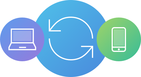
We are striving to deliver a mobile-friendly experience for all learners on Coursera. We aim to make it easy for learners to navigate back and forth between different devices. Learning on any size screen should be easy.
OLD EXPERIENCE
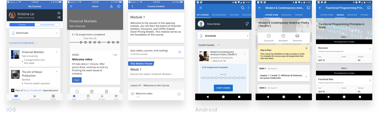
The learning experience varies cross-platform
Both iOS and Android apps function and appear to be drastically different
PAINPOINTS
Where today's experience falls short
1. It isn’t always easy to immediately determine:
• How you’re doing in a course
• What to do next
2. Navigation is complex and it's hard to find what you need.
3. The look and feel is very dated and misaligned on all platforms (web, iOS, Android)
4. Not all items are supported on smaller devices and there is no clear indicator for this.
APPROACH
Explore, test assumptions, learn, and iterate.
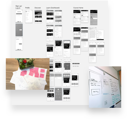
Explorations & cross-functional ideation sessions. All functions including engineering, design, and product management gathered together to brainstorm the future and potential of our mobile experience. Together, we were able to draw inspiration from a pool of ideas to produce a set of three different and rich concepts to conduct usability studies with.
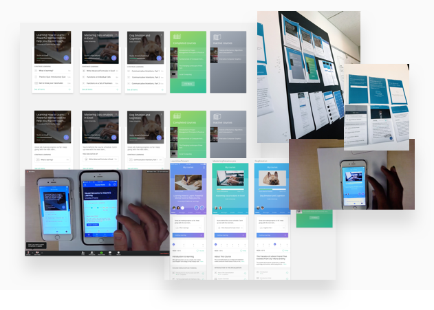
Gaining insight through research. After conducting 8 research sessions, we were able to gather qualitative feedback that helped us iterate on our concepts. We were able to leverage these insights to design and ship our latest design.
OUTCOME
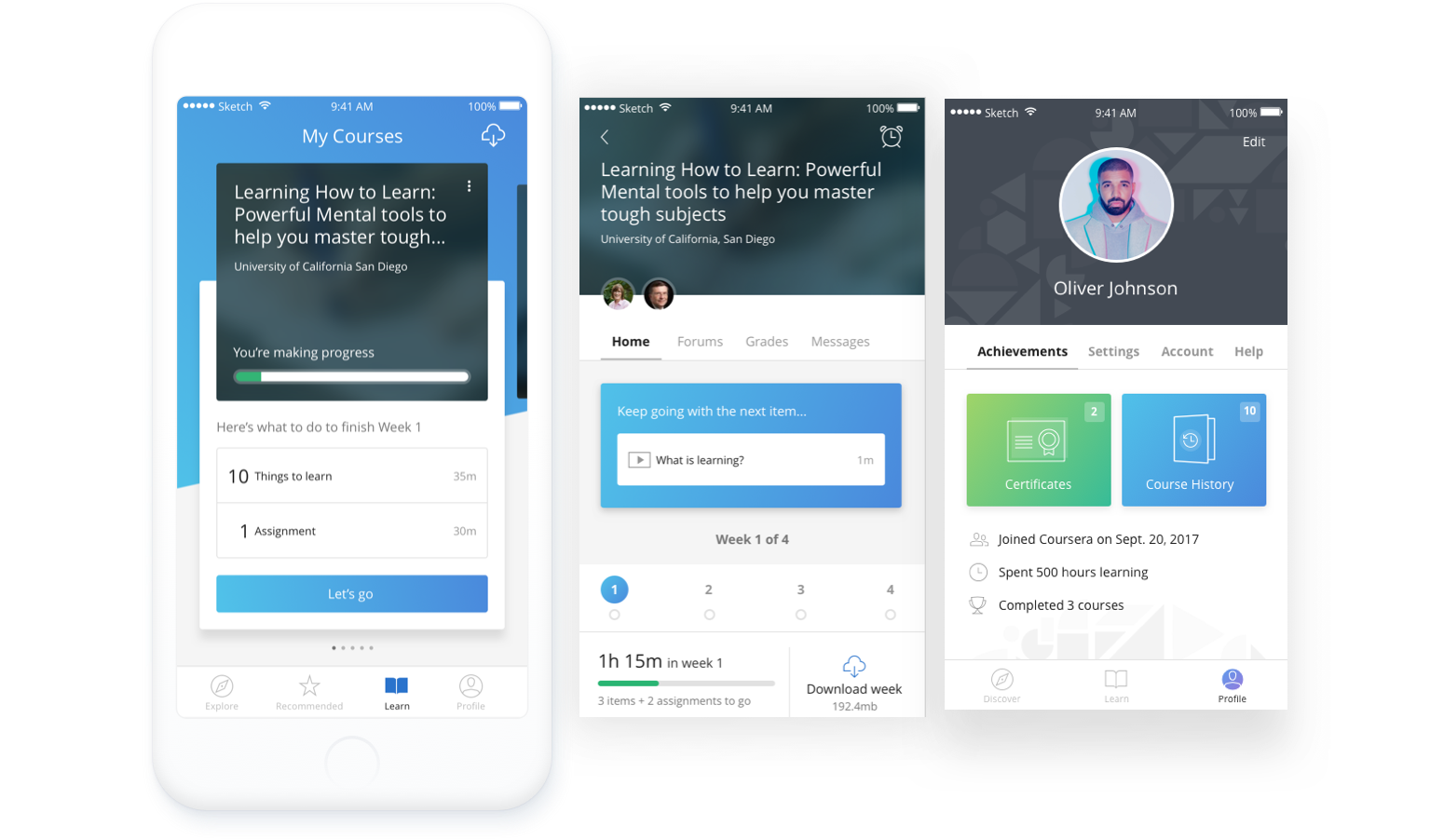
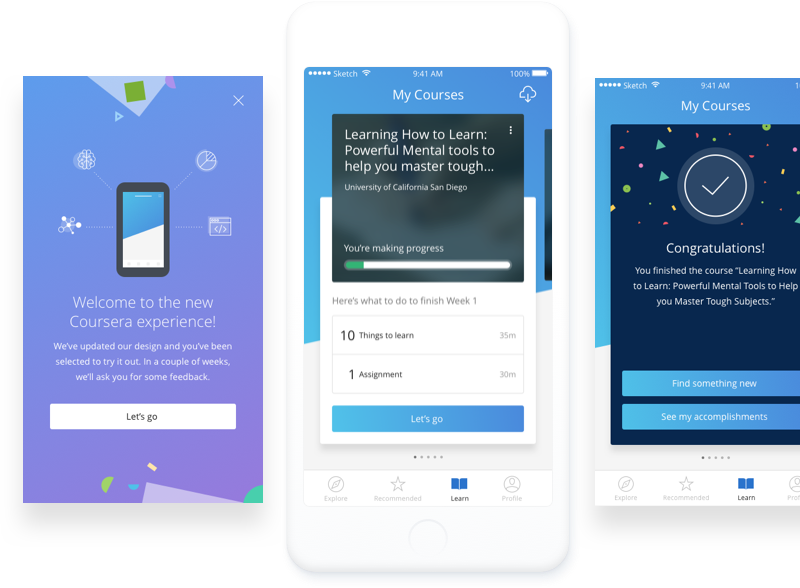
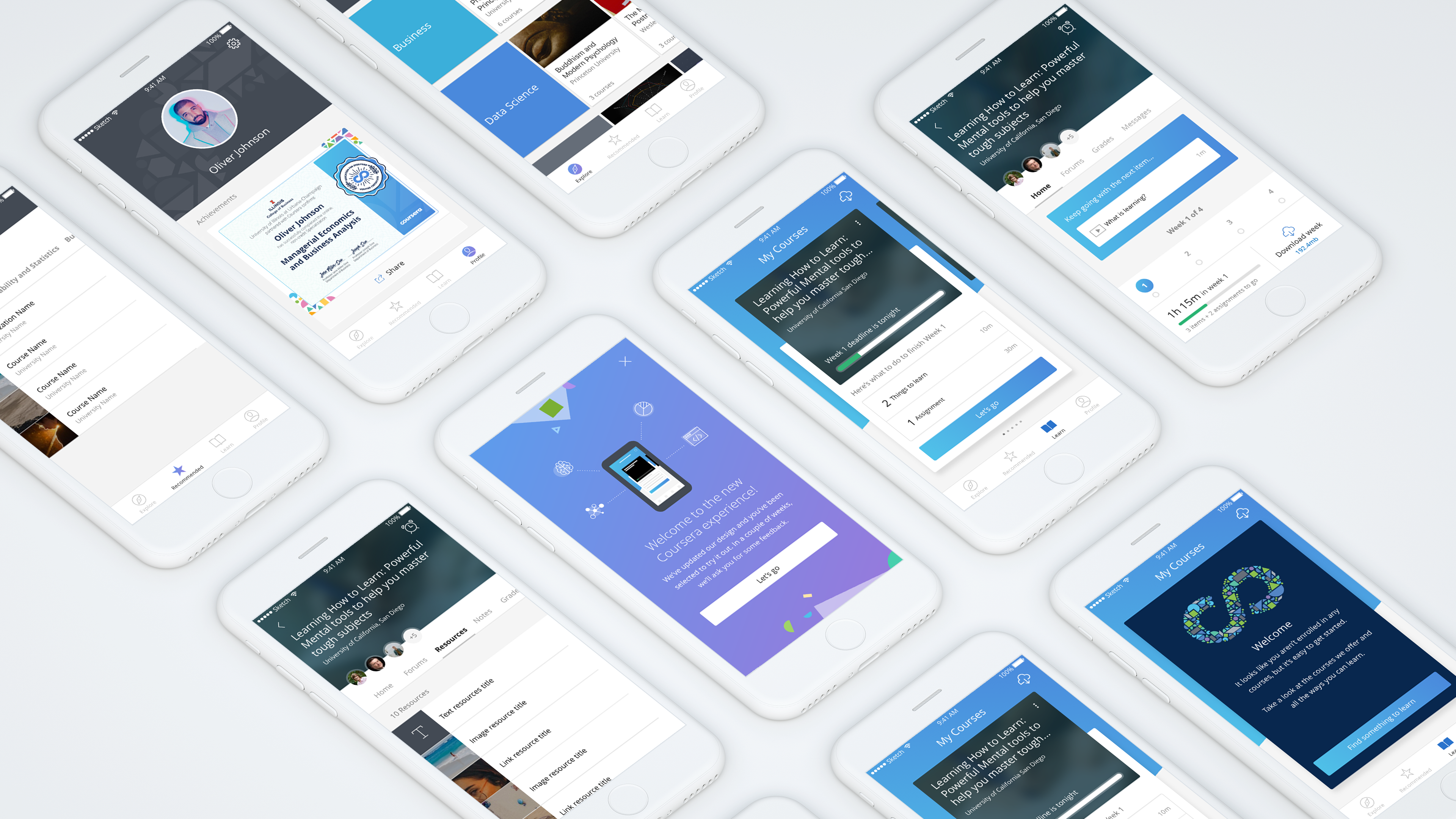
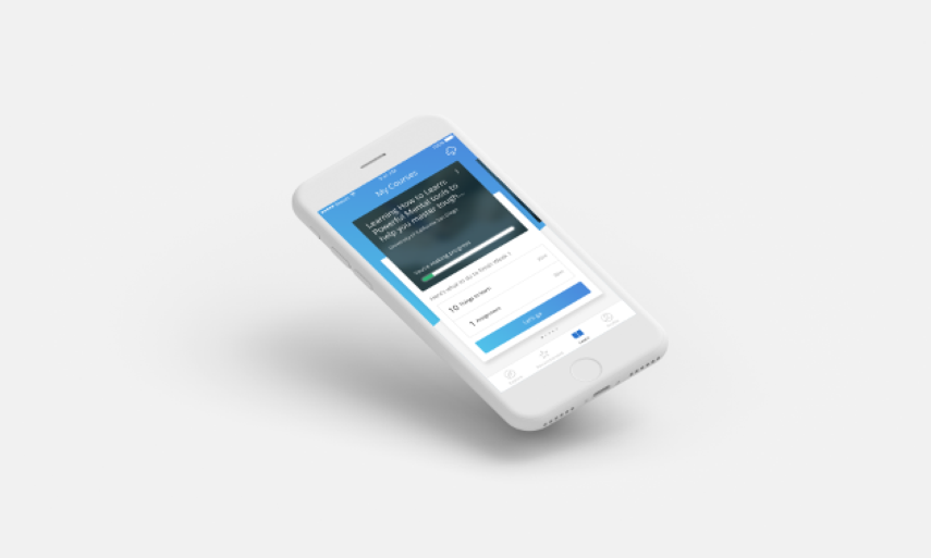
We’ve completely reimagined the Coursera mobile experience
We’ve completely reimagined the Coursera mobile experience
A clear and focused
dashboard
A clear and focused
Dashboard
Learners can see approaching deadlines, which course to focus on, and what to do when they’ve fallen behind.
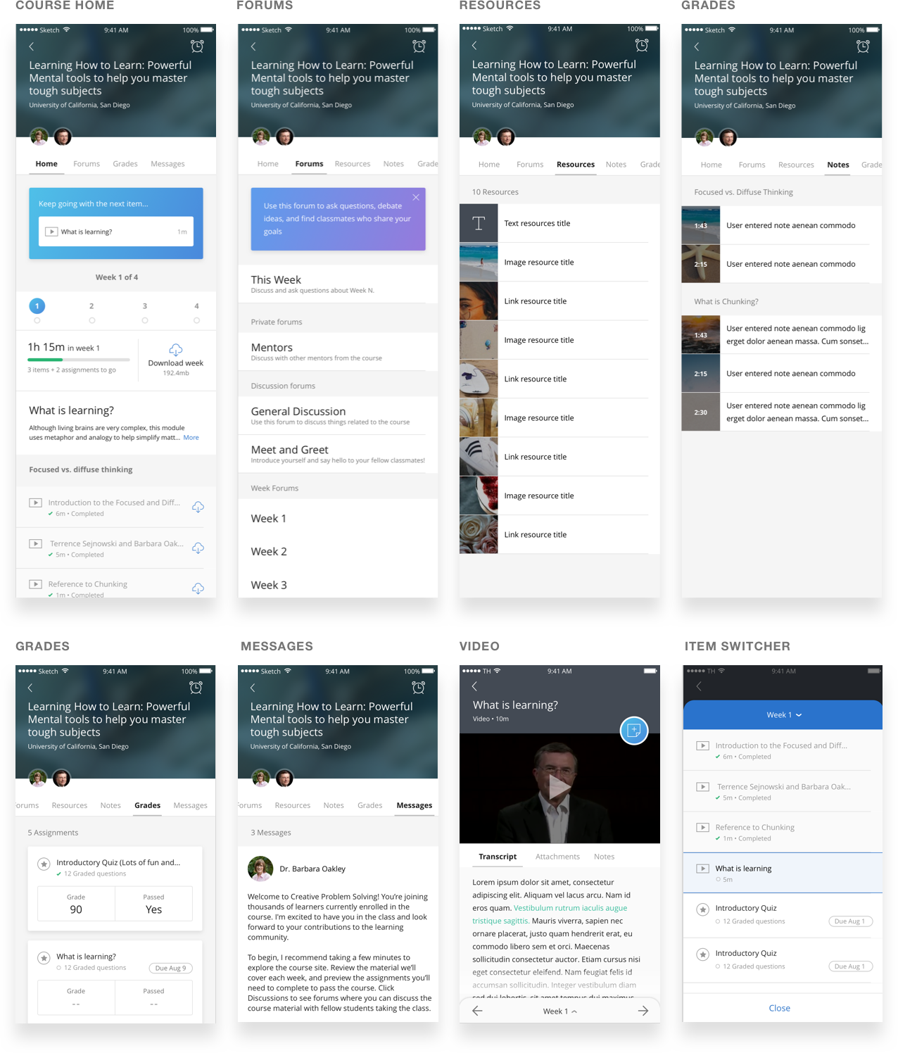
Simplified course experience
Simplified Course experience
Dive right into content, keep track of how you're doing, and see all of the course's content upfront.
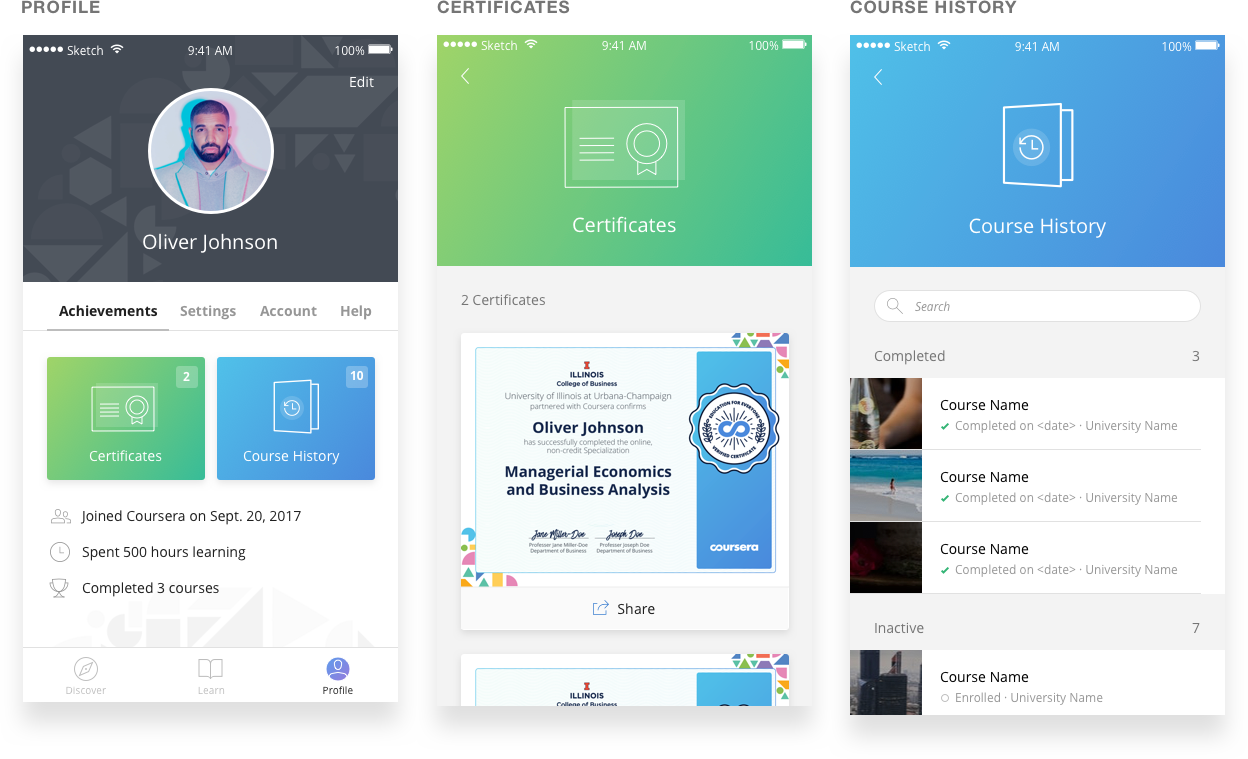
An engaging profile
An engaging profile
Celebrate your achievements and access all of your stuff.
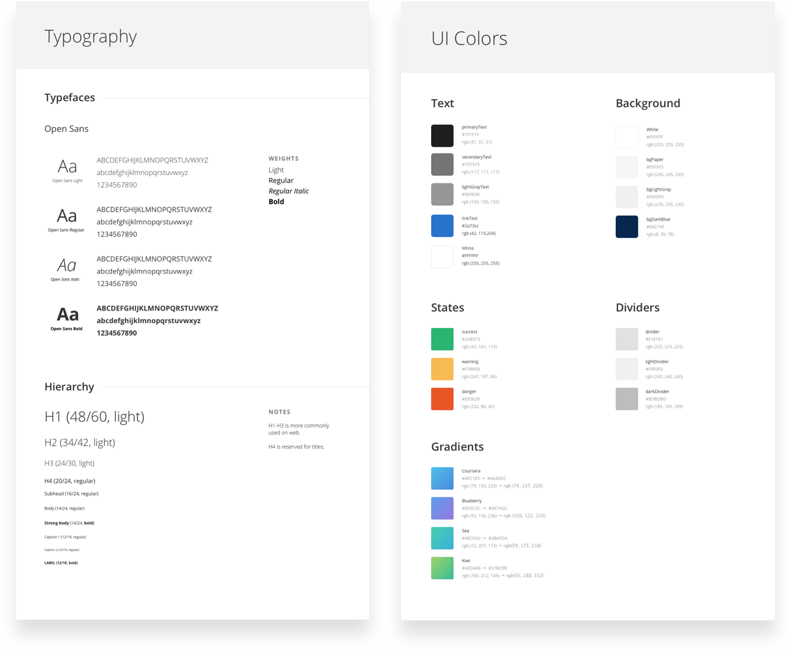
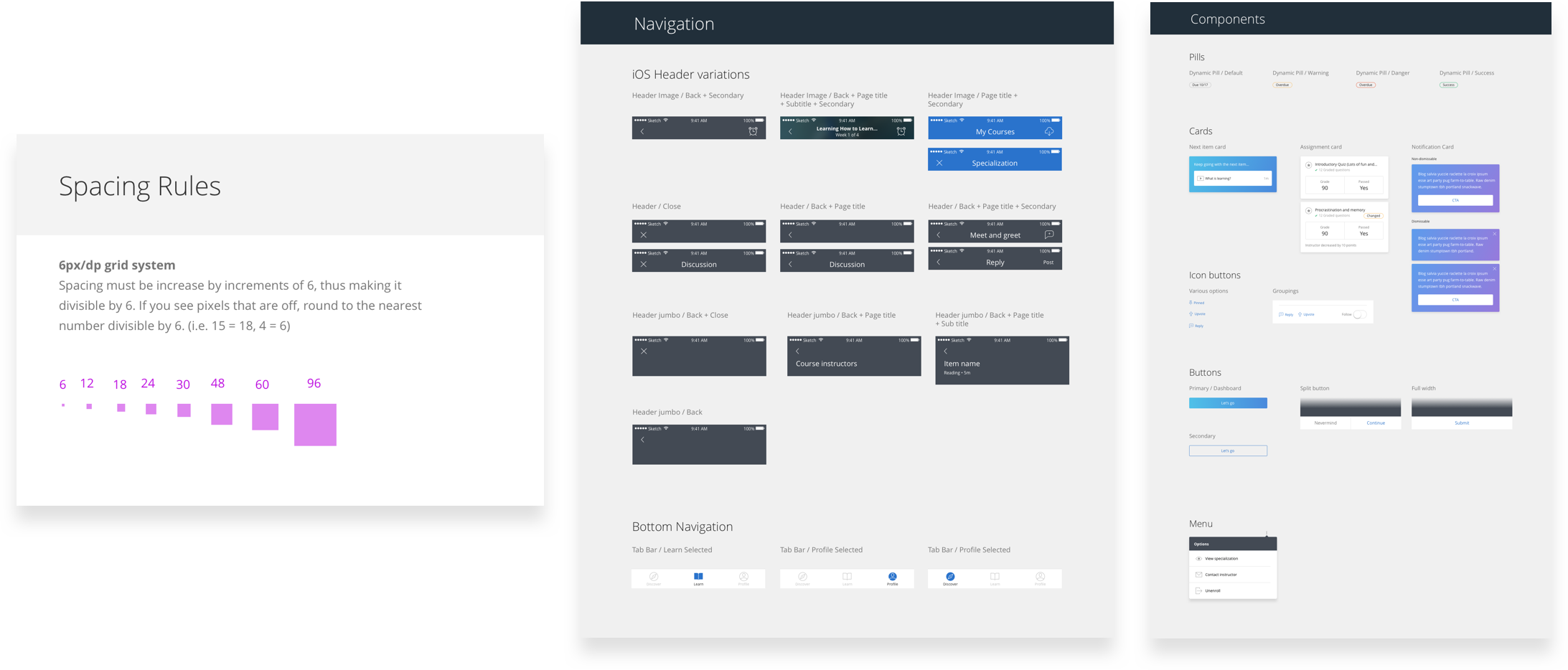
STYLE GUIDE + COMPONENTS
Driving consistency across the board
Driving consistency across the board
KEY TAKEAWAYS
Delivering quality and streamlining experiences
Delivering quality and streamlining experiences
By simplifying the navigation and making it abundantly clear how to make progress in courses, we've removed the previous barriers that learners had. The architectural and user experience improvements that we made will enable us to build for the future and continue to augment the learning experience.
This effort was also a driving force in kickstarting the web redesign project that aims to simplify the current experience on Coursera and work towards brand consistency.
The mobile redesign is rolled out as an A/B test on both iOS and Android, but it has completely rolled out due to its success and most components of it still remain in the app today.
Core Team
Core Team
Kristine Le, Ben T., Savannah W. — Product Designers & UX Researchers
Kristine Le, Ben T., Savannah W. — Product Designers & UX Researchers
Alex W. & Ken Y. — iOS Developers
Alex W. & Ken Y. — iOS Developers
Daniel R. & Anup K. — Android Developers
Daniel R. & Anup K. — Android Developers
Rohan B. — Back-end Engineer
Rohan B. — Back-end Engineer
Mustafa F. — Mobile Manager
Mustafa F. — Mobile Manager
All projects —
DaebopShowcase your creativity and fandom

Cousera Degree HomeBuilding an experience tailored for online degree learners
Coursera Mobile ExperienceReimagining the learning experience on small devices
Alice 🔒AI course assistant. [Locked] Confidential project.

MindsetAuthentic, vulnerable story-telling and wellness platform

Evernote for AndroidMaking notetaking wherever you go as seamless as possible
Three Petals Floral DesignTimeless & modern brand identity
UCSD University CentersGraphic & web design for UCSD concerts, facilities, and events

Dive StudiosA home for the latest K-Pop podcasts and diverse immersive audio and video experiences.

Google - Core People UXBuilding scalable and intuitive experiences for Google's heart and core—its people.